How to create a great Twitter banner. 22 examples.
Last update: 2022/07/07
You need to generate attention if you want more Twitter followers.
Once you get it, people start checking your Twitter profile. That's when they enter your creator funnel.
This funnel is composed of various pieces that, when combined, have the sole purpose of building trust with the potential follower who is viewing your Twitter profile.
We’ve already covered two of those pieces in our previous posts. We’ve talked about How to write a great Twitter bio and How to create a great profile picture.
Today, we are going to talk about the most underrated piece of that funnel: the banner.
Why is it important to have a great Twitter banner?
It's no secret that your profile picture is the highlight of your profile. It's what people see first. But if paired with a strong banner, trust-building (and getting followers) is much more likely to occurr.
A good banner also shows that you understand branding. It shows that you are treating your profile as a brand (because it is). It can be the perfect complement to a high converting profile.
There’s no right or wrong way to approach banners. Every person has their own way of communicating, and that is often reflected in the banner. Take a look at these 22 examples.
Examples of great Twitter banners
When it comes to creating your banner, you can take different approaches. Based on looking at hundreds of creator profiles, we've uncovered a few trends you may want to consider when creating your own.
Standard banners
These are people that use the Twitter banner as, well, a banner. You won't see anything crazy here but it goes to show the standard use you could give your Twitter banner.
Austin Belcak (@austinbelcak)
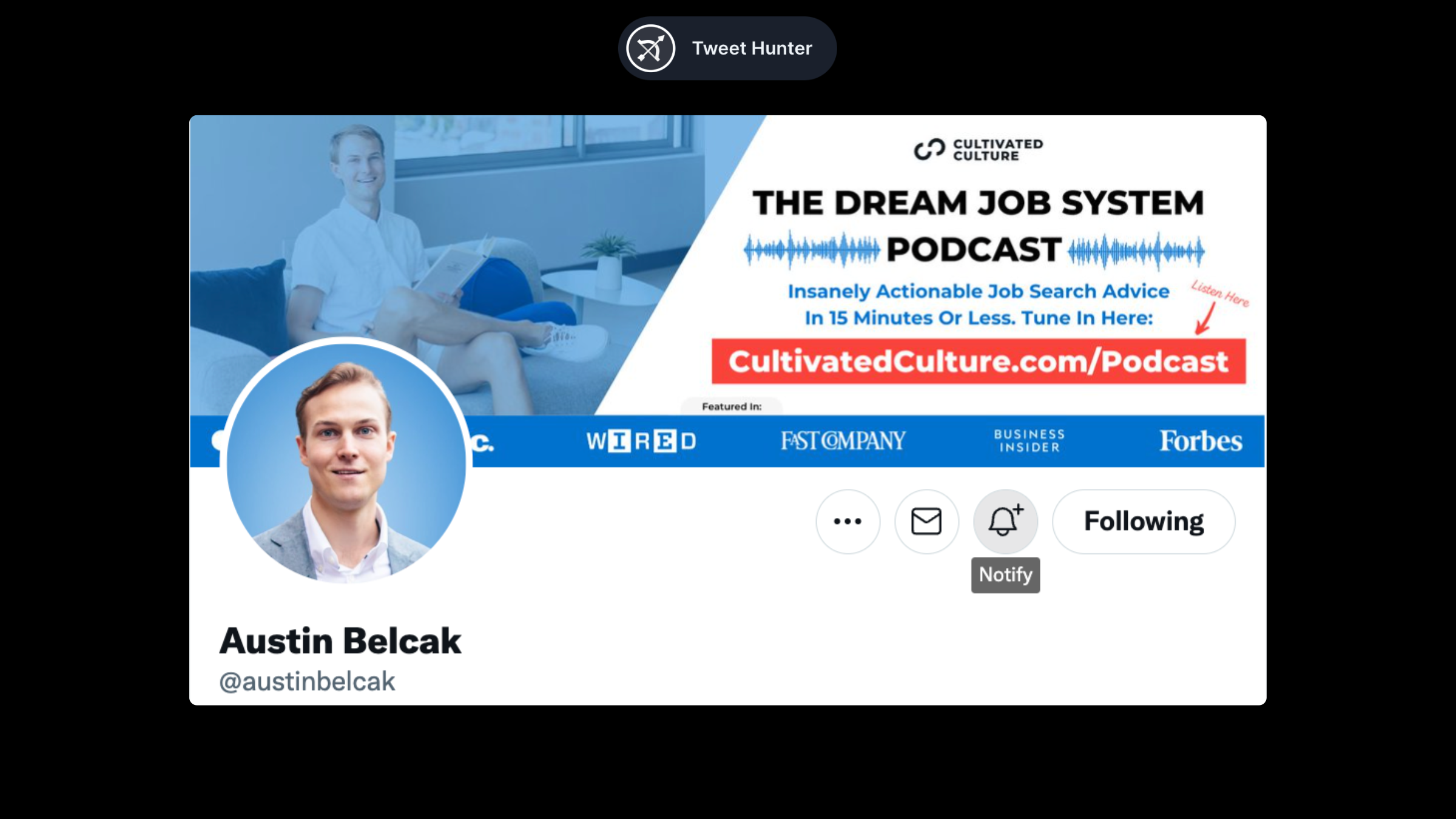
Austin's banner does two things: it keeps brand consistency with his profile pic because of the color choice, and it works as an advertisement for his podcast.
It is perfectly normal to use the Twitter banner in this way. The purpose is to get people's attention towards a certain project, idea or website.
Clint Murphy (@IAmClintMurphy)
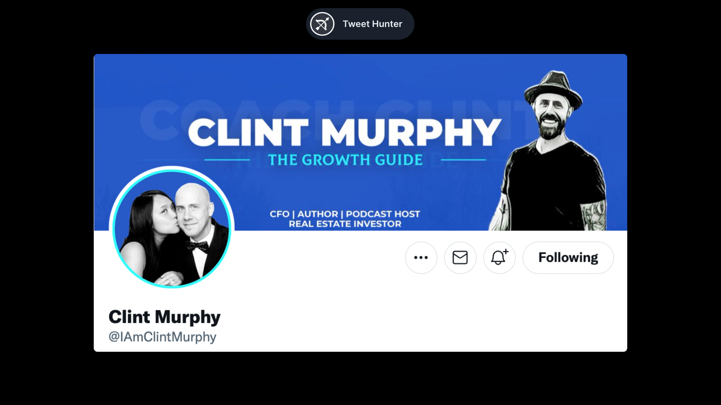
As in Austin's example above, Clint uses his banner to maintain consistency (with colors).
We see a bit more of him and a few keywords of what he does. This gives a little more context to people checking out his profile.
Noel Dávila (@NoelDavila)
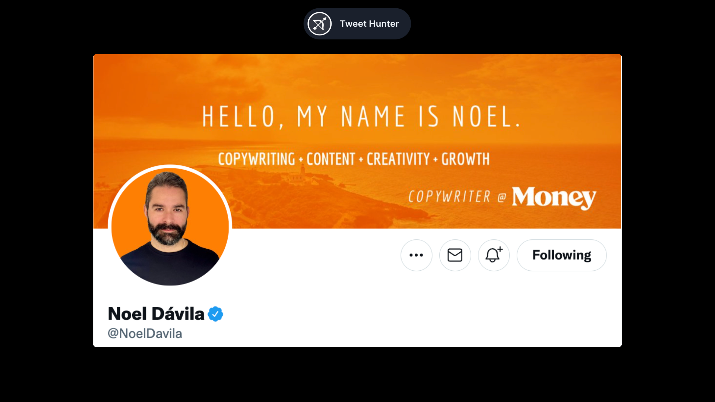
Noel also maintains color consistency with his banner. He then highlights several keywords to explain what he does and what he is interested in.
Ramli John (@RamliJohn)
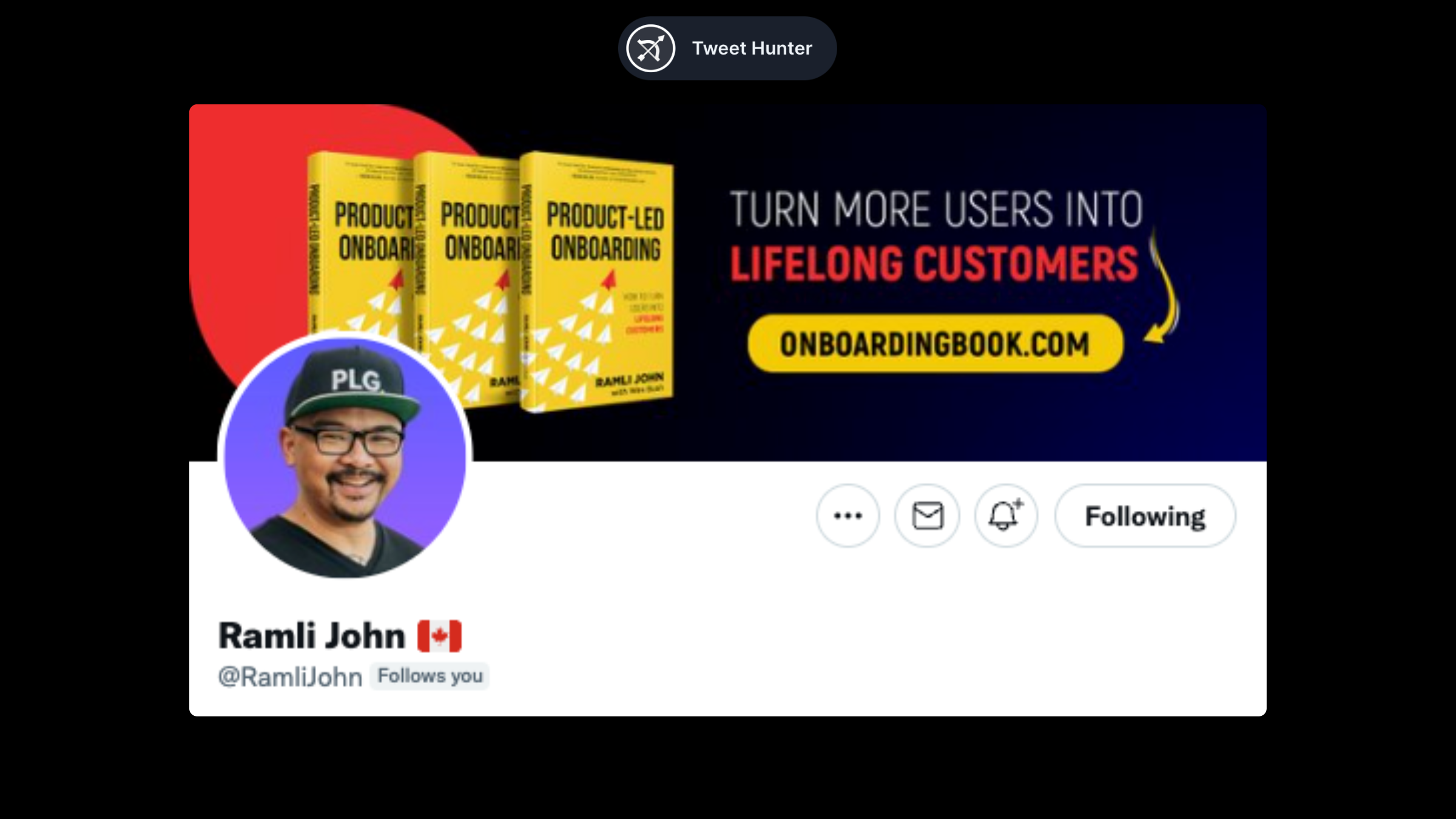
Here's another example of a real-life banner being replicated. Ramil uses the space to promote his book and website. It makes sense, right?
“Quote” banners
Some people prefer to have a quote on their banner. But attention, this is only good if the quote is related to your niche.
Dave Kline (@dklineii)
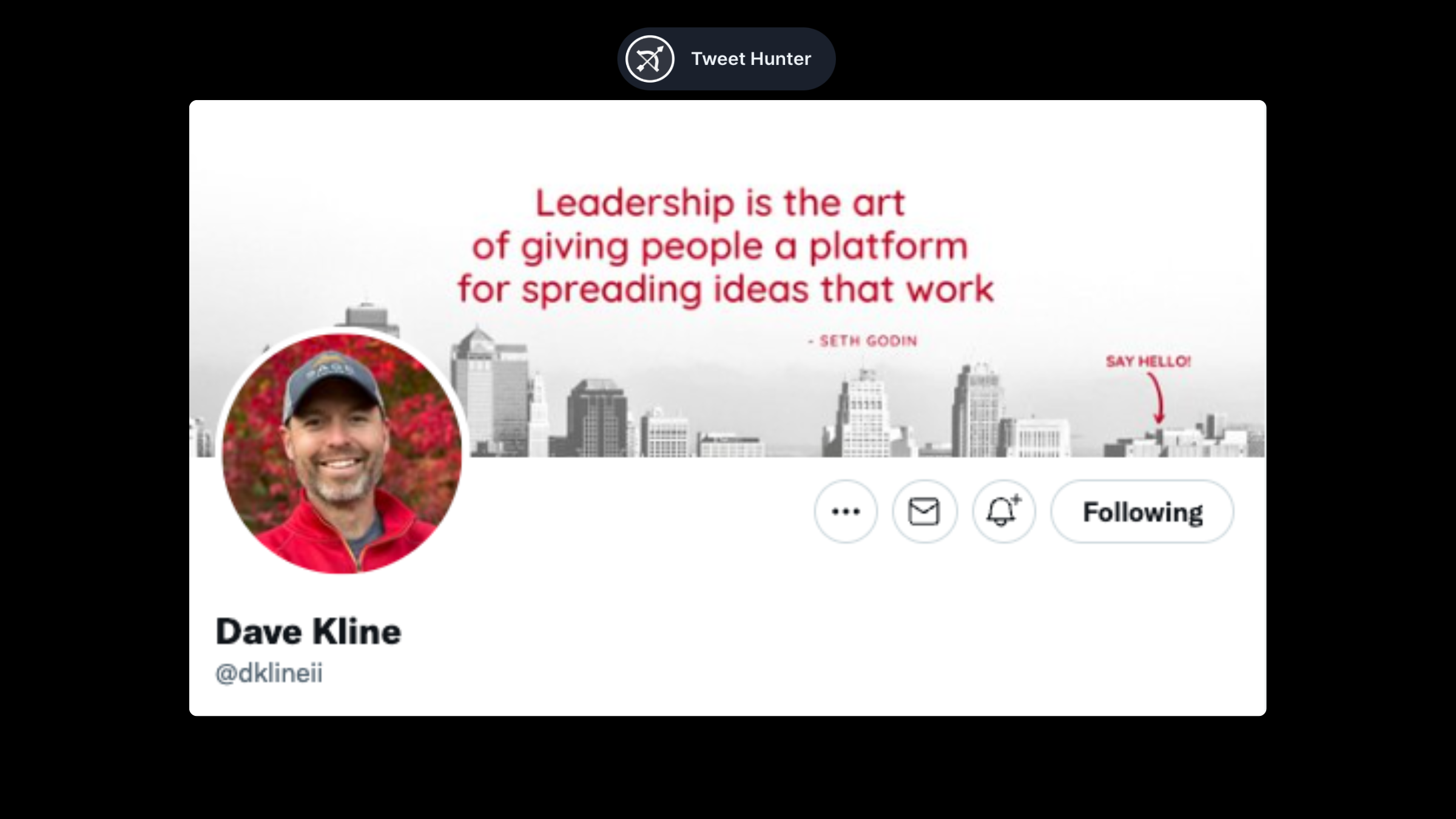
Dave's content is designed for leaders. This quote fits right in. Additionally, the colors match his profile picture, making it a nice-looking banner.
Art of life (@Art0fLife_)
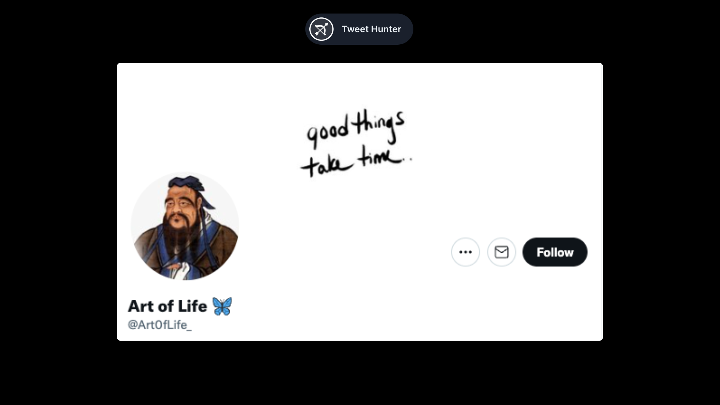
The Art of Life is one of those accounts that gives insight into how to leave a better life. The quote perfectly fits that sentiment.
Vedika Bhaia (@VedikaBhaia)
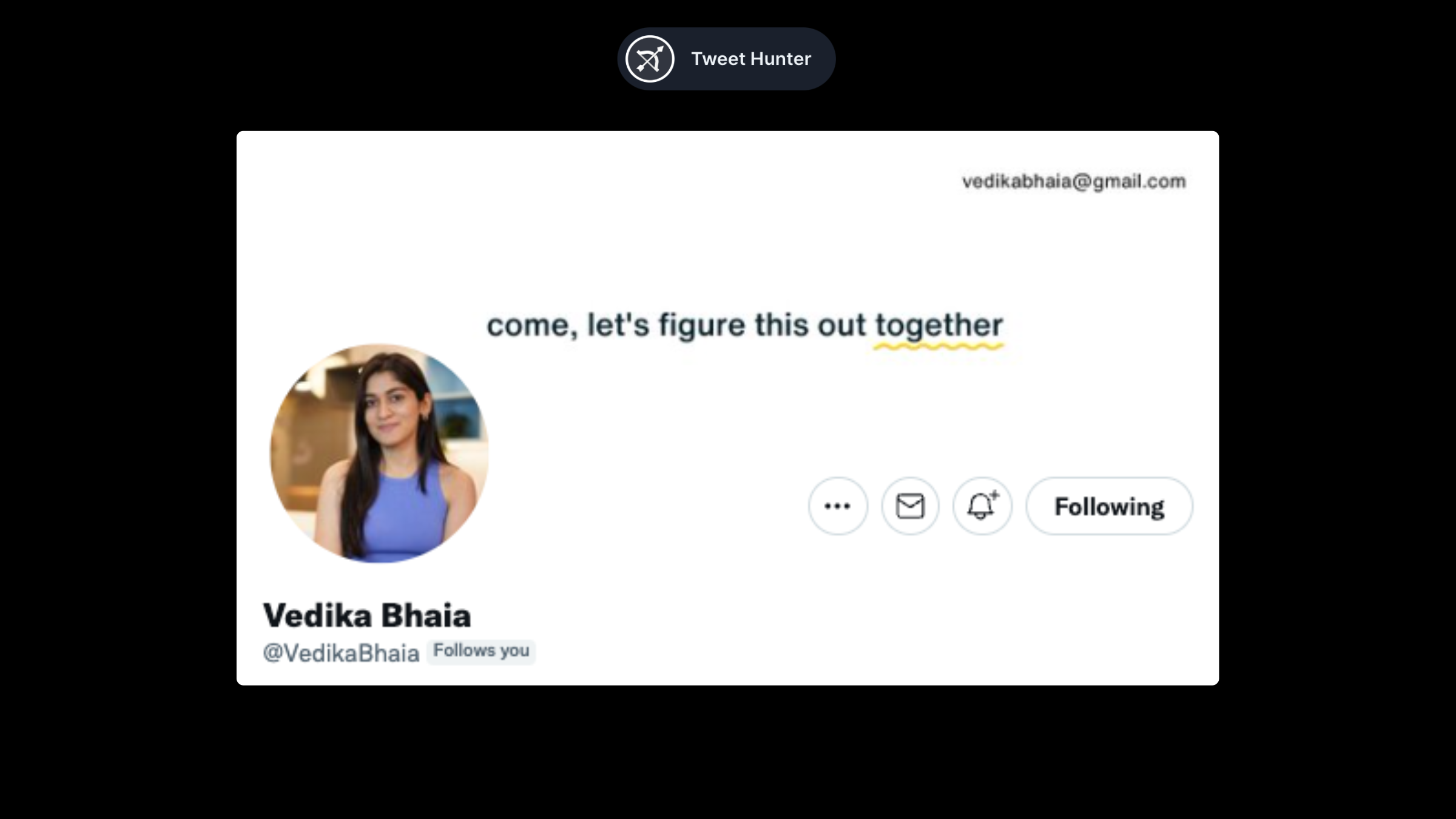
Although this is not a quote per se, it works as well. Vedika talks about marketing and entrepreneurship. These are skills that can be learned with others. Her banner illustrates that point perfectly.
Visual banners
Charles Miller (@writingtoriches)
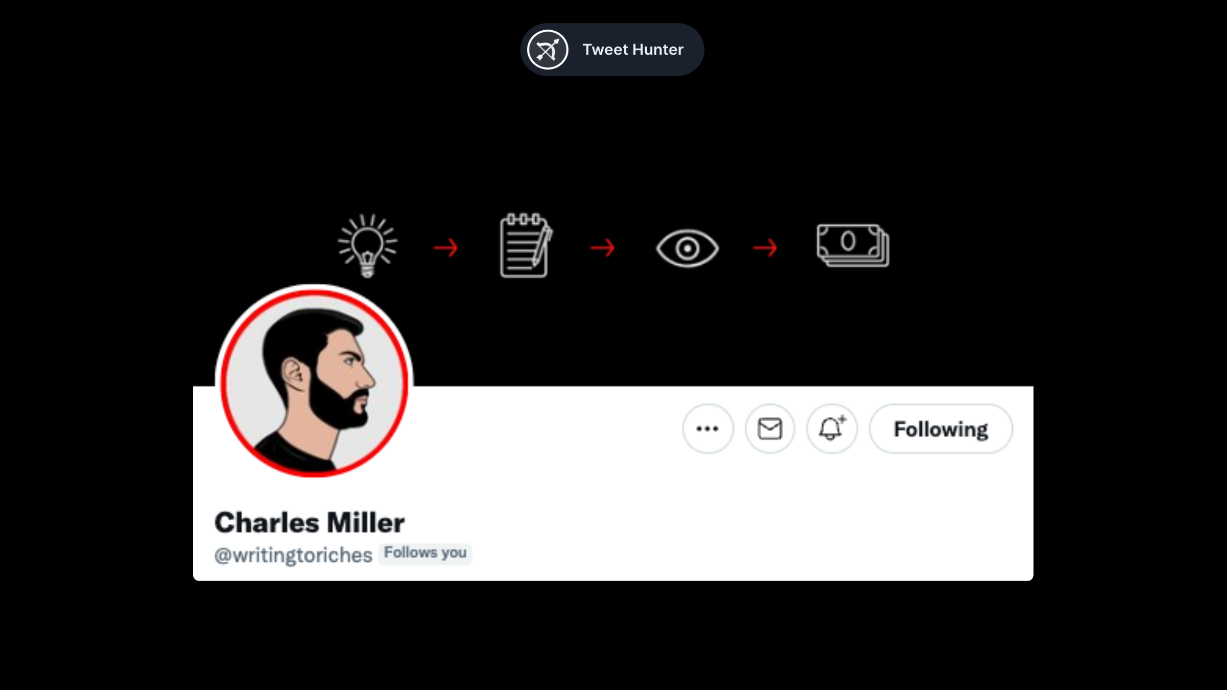
A simple banner like Charles' is sometimes all you need. In just four steps, it illustrates what he teaches in his content. Excellent banner.
Alex Llull (@AlexLlullTW)
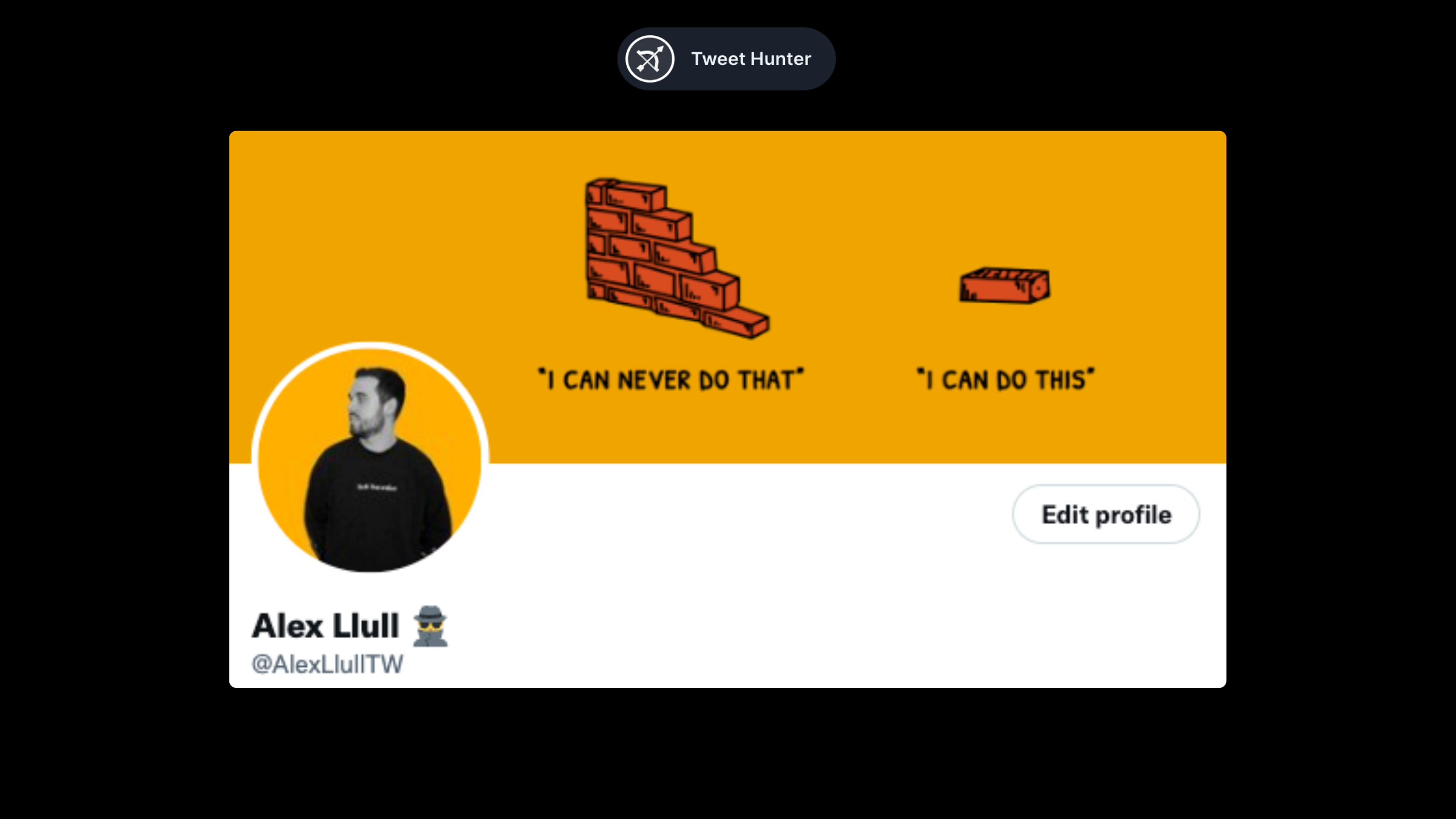
Alex's banner is more aspirational. All of his content focuses on generating opportunities for creators. To accomplish that, the first step is to realize it is a "brick by brick" process. The banner reflects that.
Alex Maese (@AlexMaeseJ)
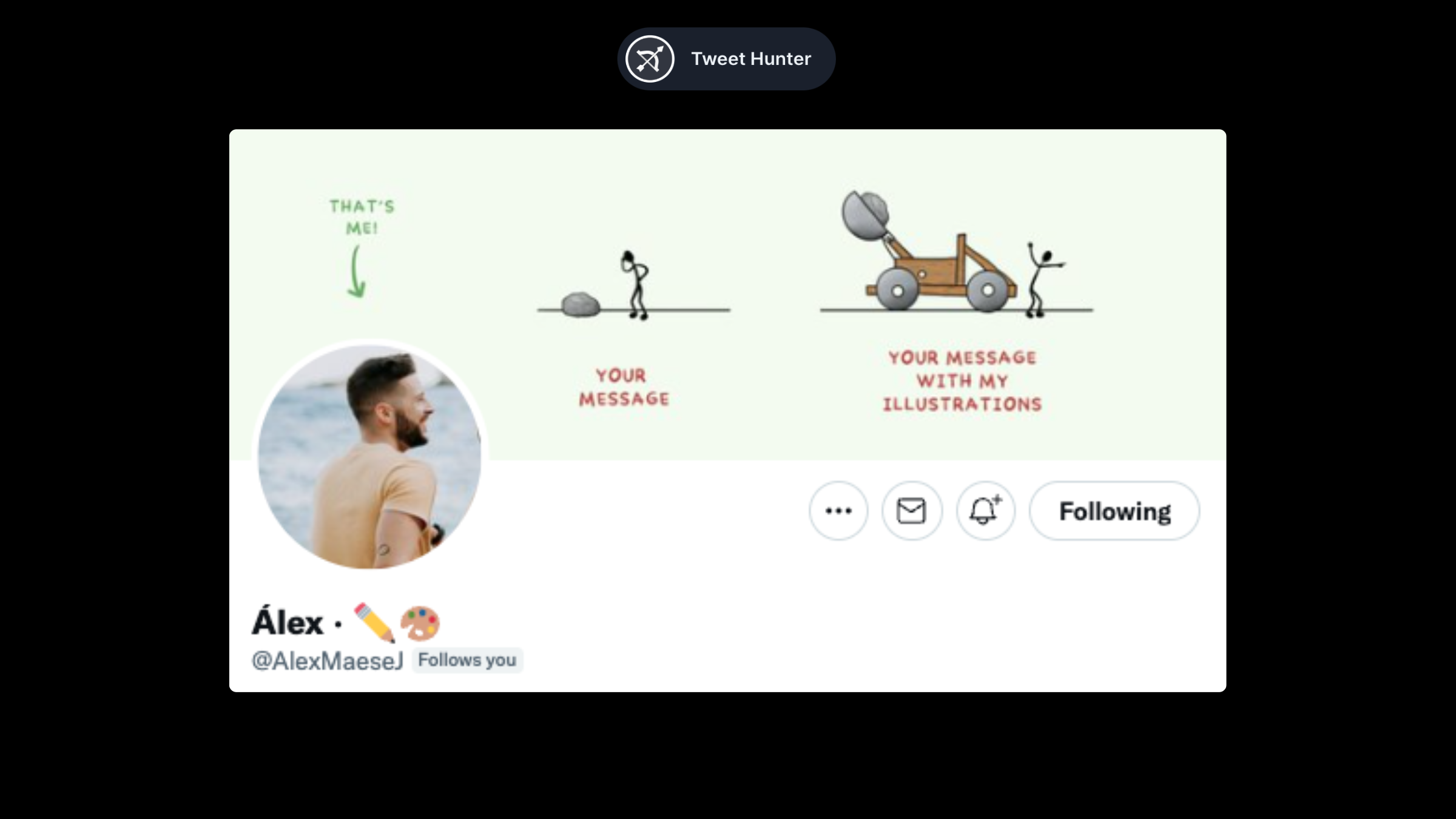
Alex's banner is visually appealing AND pitches his services at the same time. Clever.
Blake Burge (@BlakeBurge)
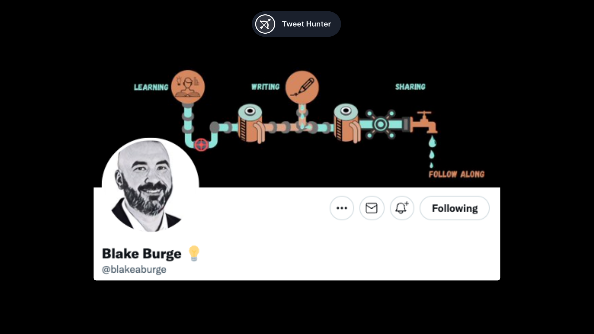
Blake's banner is a little more simple than that, but it's still awesome. It incorporates all his interests into a pipe system that ends in a drop, symbolizing his content. A great idea.
Janis Ozolins (@OzolinsJanis)
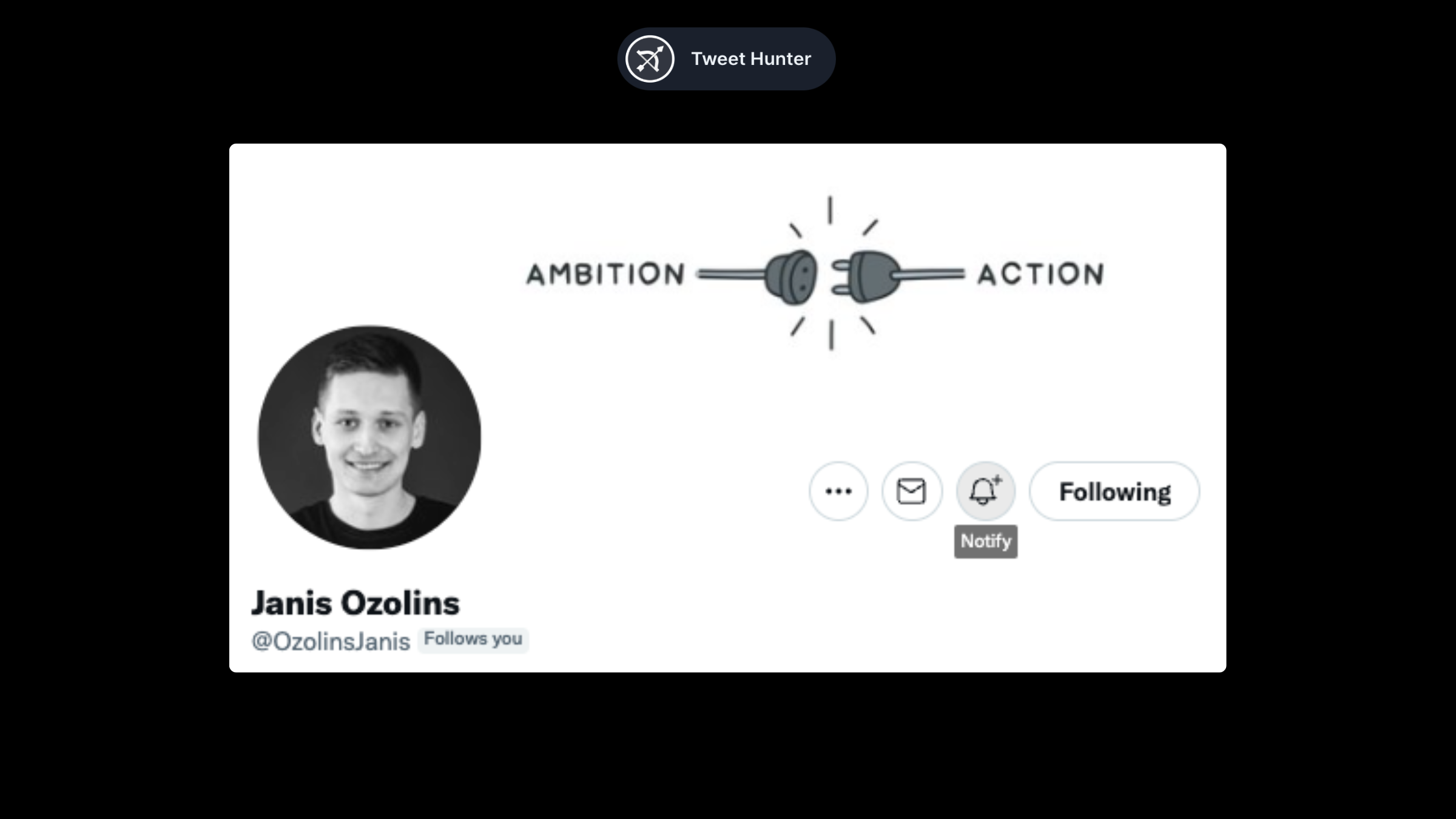
Banners can also be used to convey a message. This is Janis’s case. When you pair a strong message with a great visual, you get a banner like this.
Call to Action banners
The Call to Action banners are those that encourage people to take one specific action, usually following the user.
Ali Ladha (@AliTheCFO)
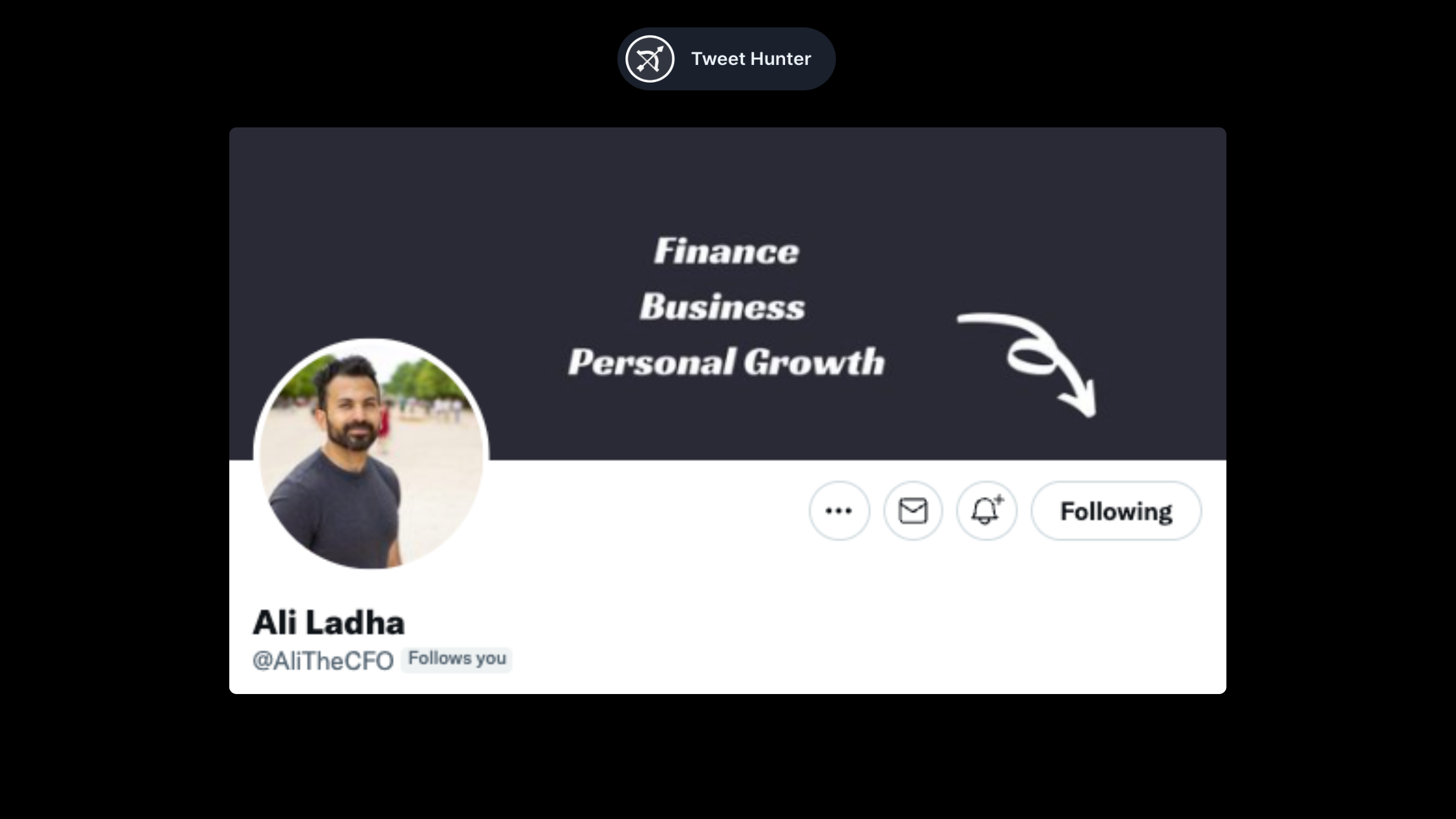
Ali's banner is simple, but it works. There is a description of the topics he covers, and an arrow points down to the follow button. That's all you need.
Gavin Bell (@MrGavinBell)
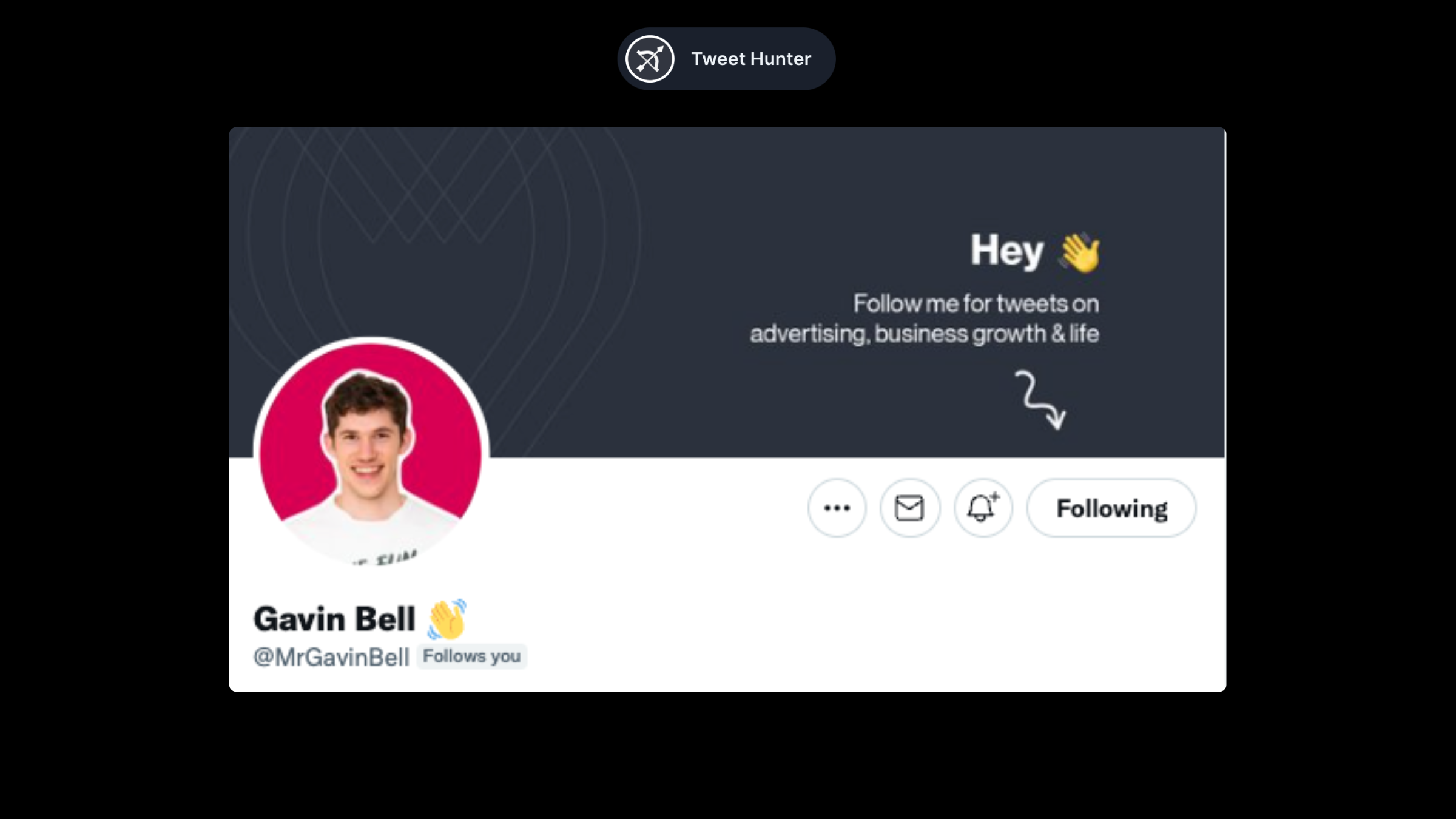
Similar to Ali's example, but formatted differently. The emoji makes it a little more friendly.
Aadit Seth (@aaditsh)
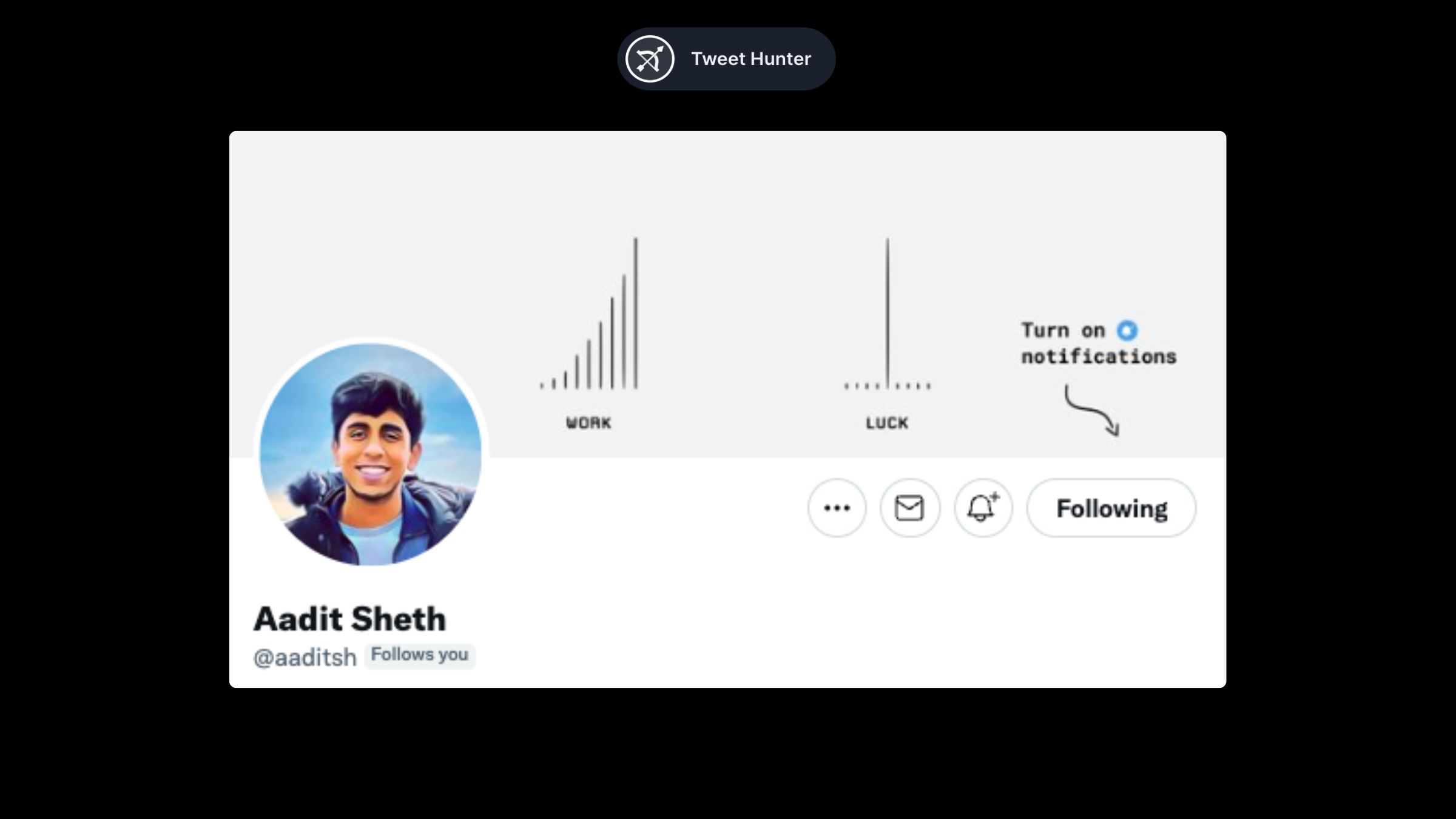
Adit combines the visual banner with a call to action. We get a banner with a clear message from him + an invitation to hear more by clicking the notification button.
Jim Raptis (@d__raptis)
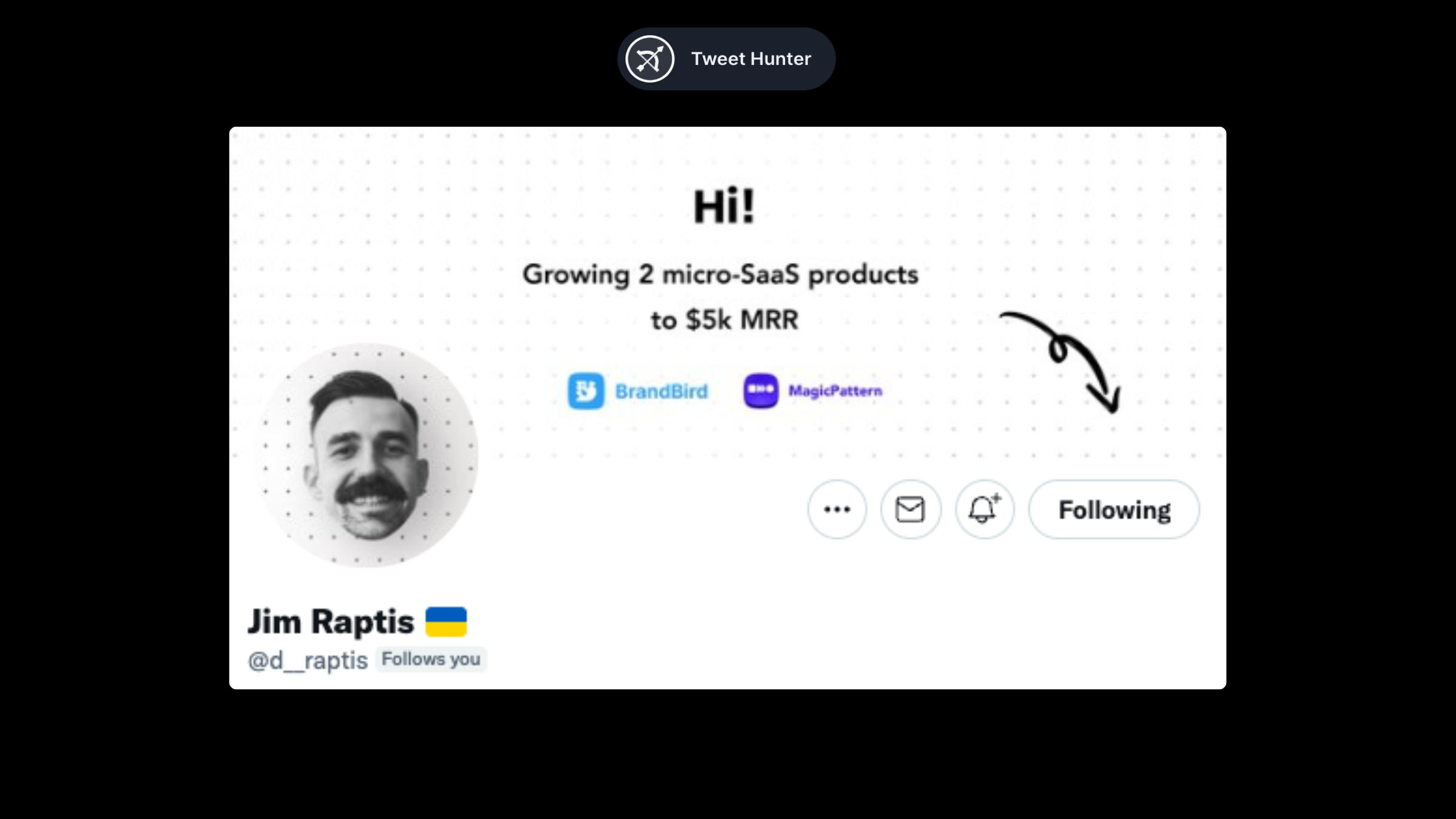
Jim's banner is a perfect introduction. "Hi, this is me and this is what I'm doing. Follow for more". What more do you need?
Playful banners
In this section, we will cover some profiles that stood out as being different from others.
Tibo from Tweet Hunter (@tibo_maker)
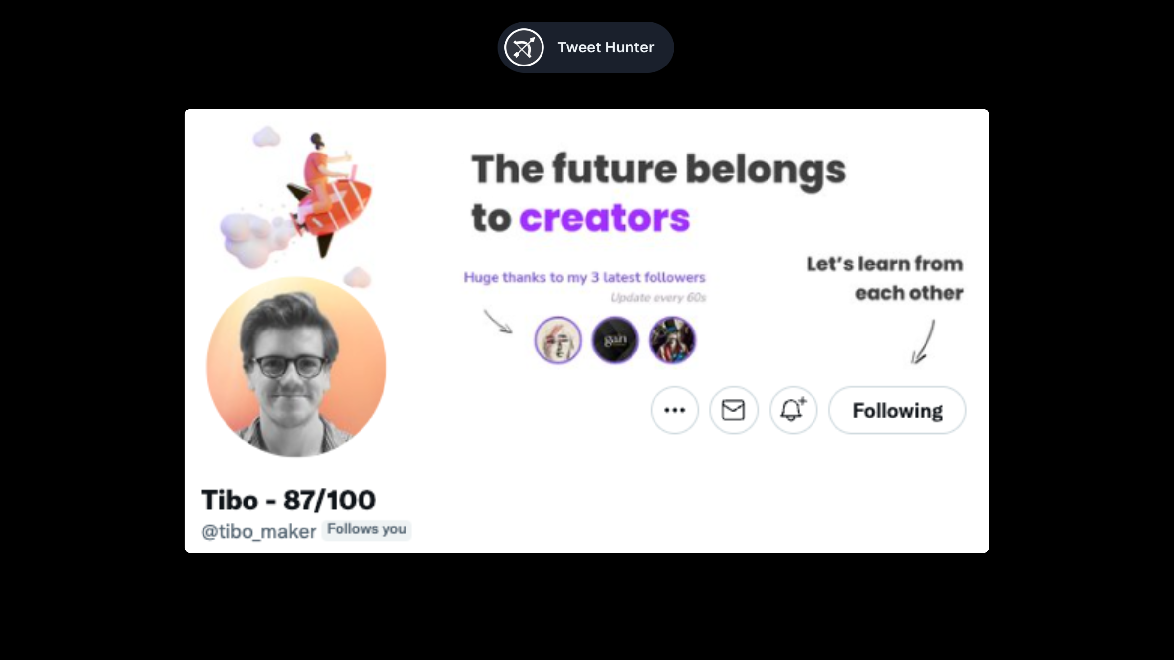
There are several elements in Tibo's banner that complement each other.
We begin with a big statement, which shows us what Tibo is all about. We are then called to follow him with the arrow, a classic. Lastly, we see a picture of his last three followers, which is updated every 60 seconds.
It's a cool gamification trick to get more people to convert into followers to test it out! It also adds social proof since real people are signing up to follow him.
Tom from Tweet Hunter (@tomjacquesson)
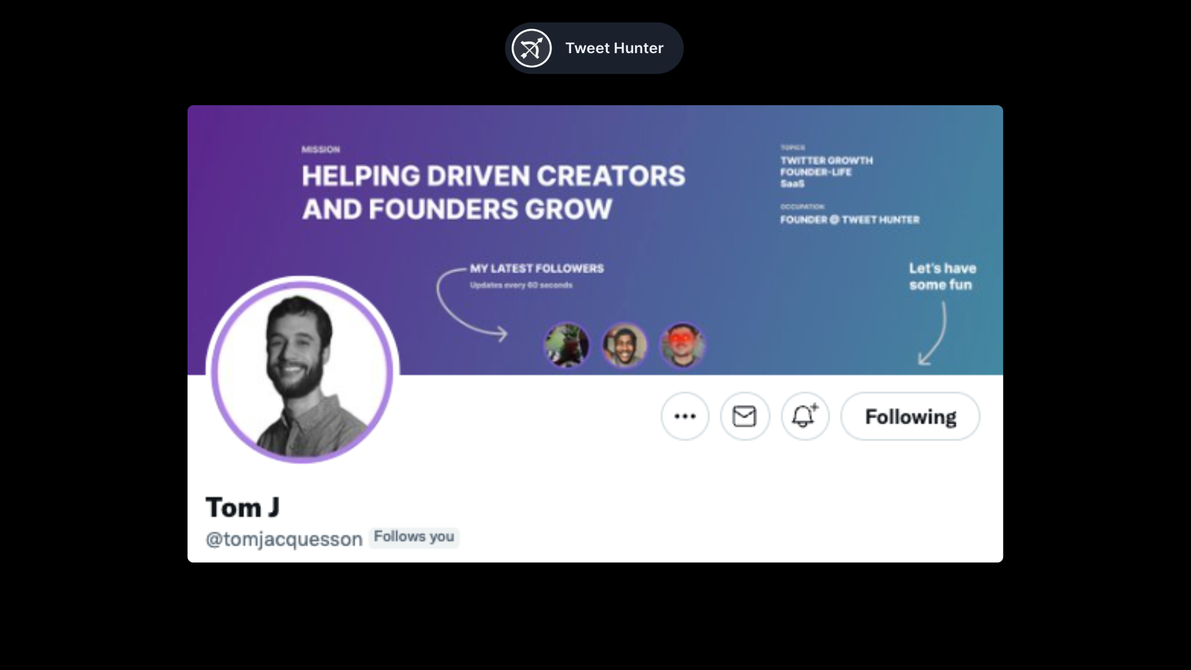
A very similar profile composition on Tom's banner.
In his, the sentence is more focused on what he does (helping others grow). He explains what he does (Founder of Tweet Hunter) as well as the topics he covers. His banner concludes with a call to action.
Victor Mariov (@vponmariov)
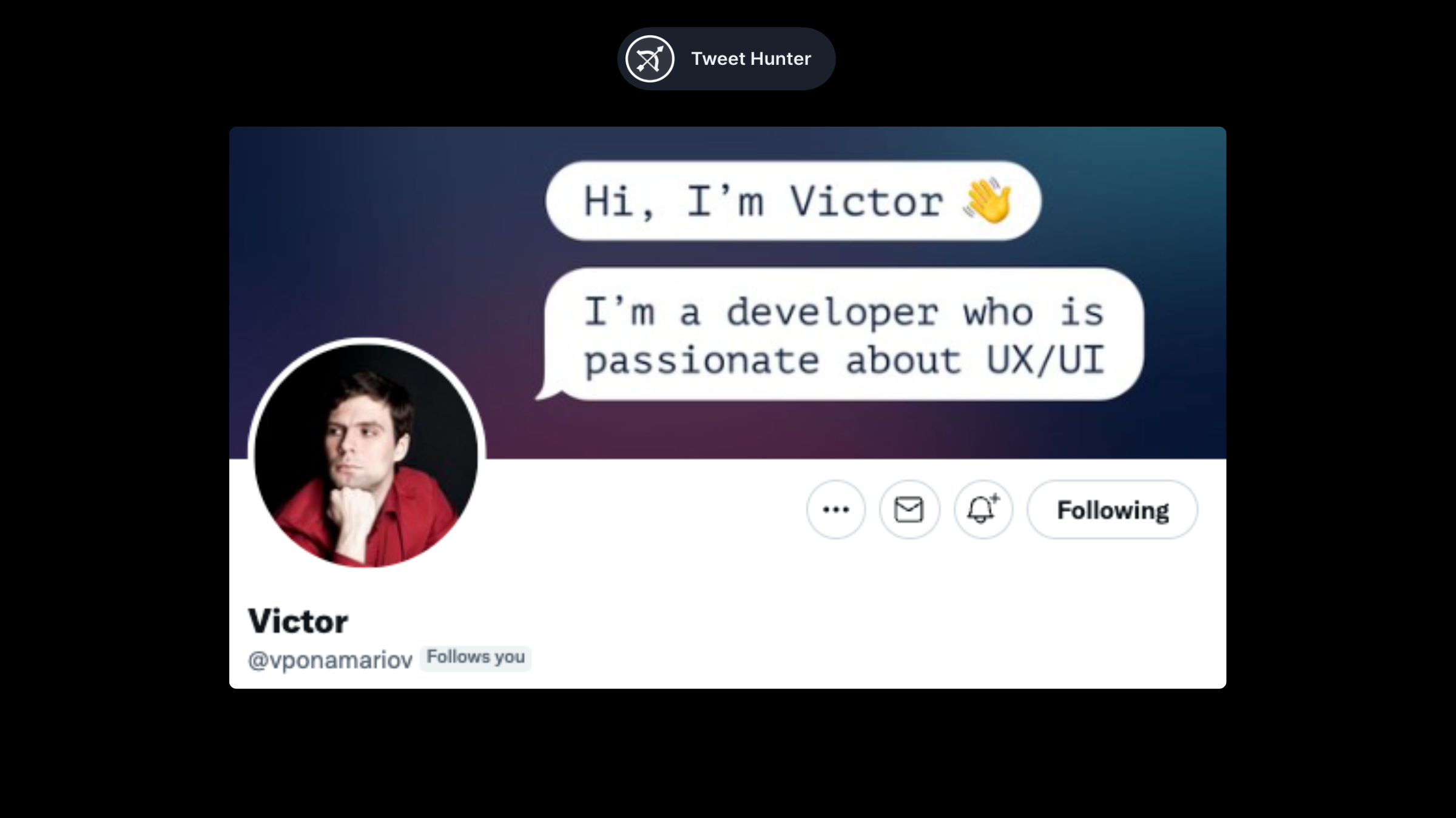
Victor's banner is fantastic. He uses the speech bubble to draw attention to the banner. He then uses the space to introduce himself and what he is interested in.
Other banners
We finish our roundup with banners that we could not classify into each of the topics above.
Steph Taylor (@launchmagic)
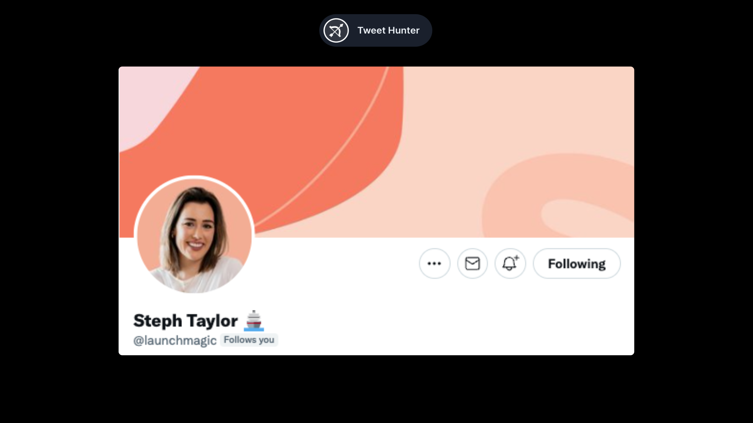
Not sure what to put on your banner? Or simply not interested into anything complex? Follow Steph's example. Simple color layouts are just fine.
Eddy Quan (@waronweakness)
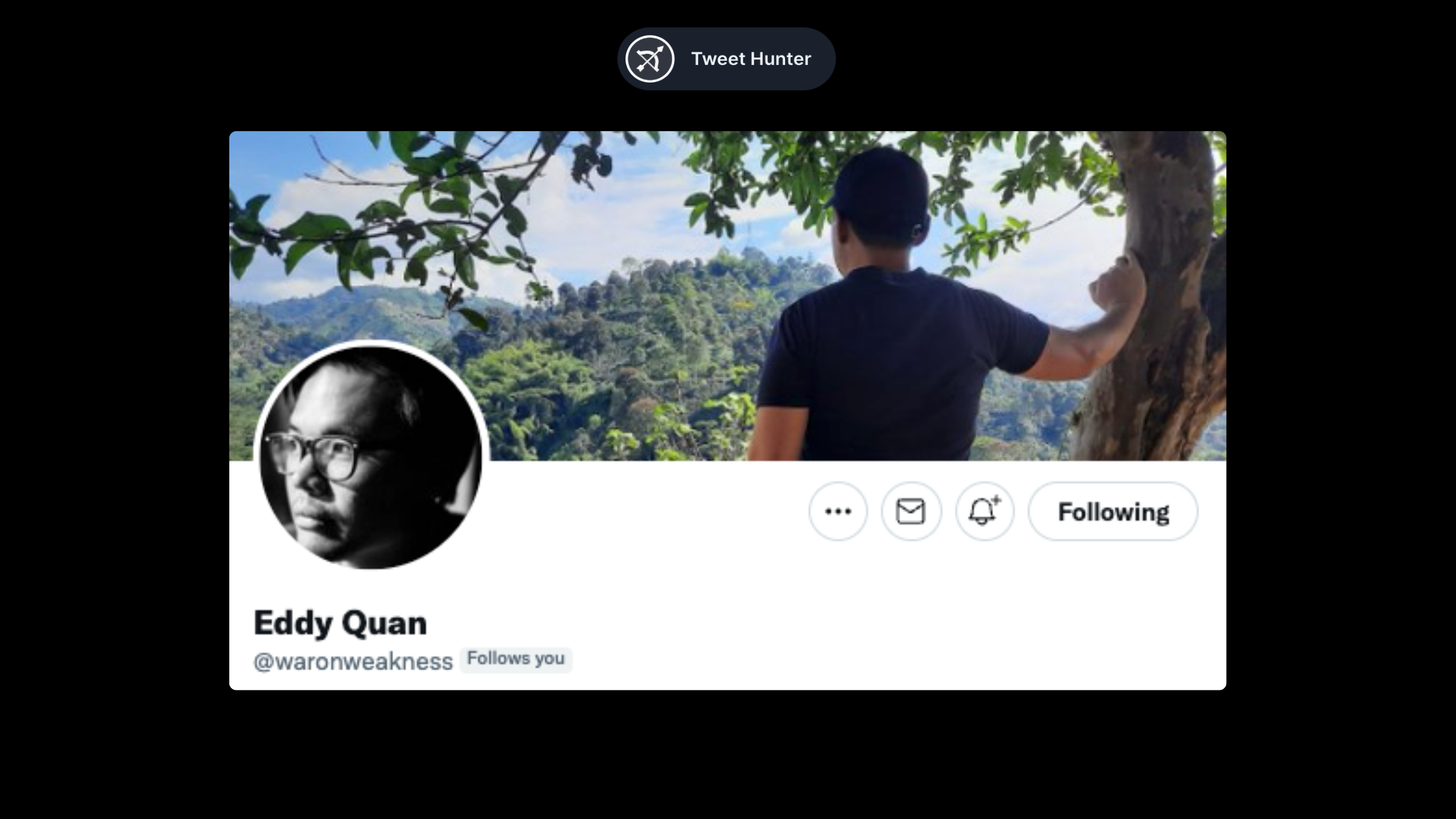
One classic banner style we haven't covered yet is the landscape. Stay away from classic landscapes. A good choice is one that somehow captures your personality.
Joey Justice (@heyjoeyjustice)
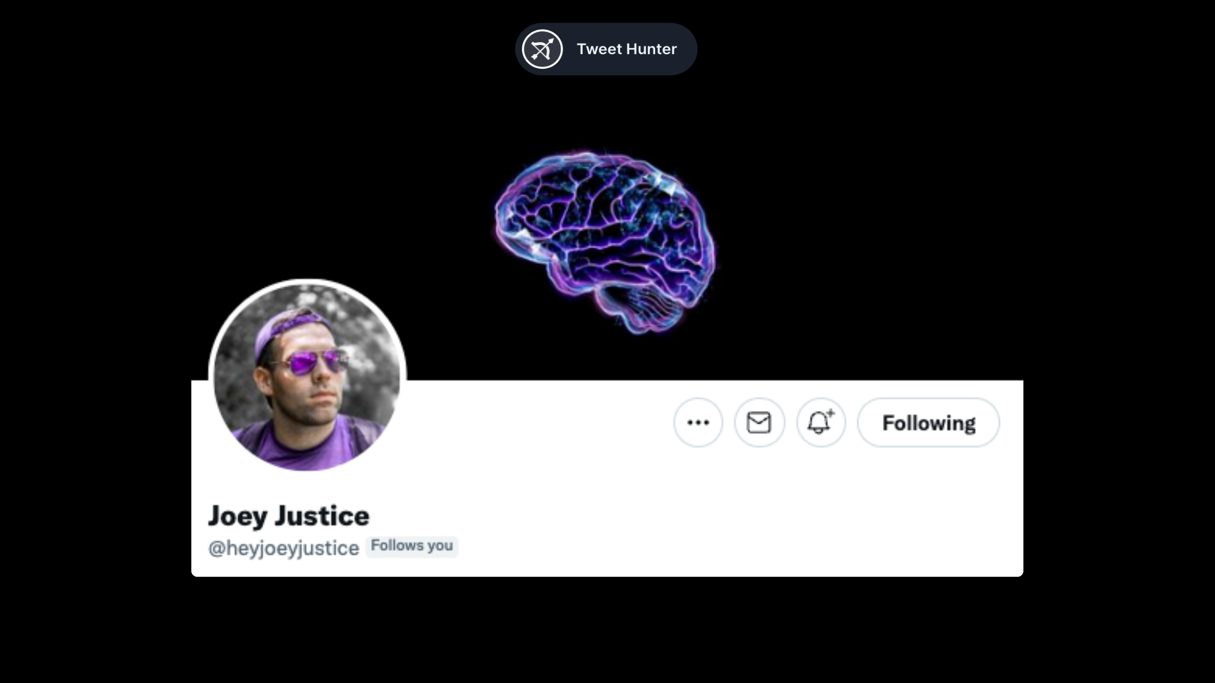
A picture is worth a thousand words. If you lack the skill or interest to use visuals, you can use a simple picture instead.
In this case, Joey talks about psychology, and his brand colors are purple. This is what you get when you combine the two.
Your banners are more than a simple landscape
We mean it when we say banners are underrated. Most people don't pay attention to them. The vast majority simply upload landscape photos or nothing at all. We find banners to be the perfect complement to a strong profile. Though it isn't essential, it is nice to have.
Choose one of the styles we discussed above, or come up with your own. What is important is to know what you can do with it and put it into action.
What will it be?
That’s it for now! If you still have doubts about this whole building an audience thing, let us try to convince you.
Ready to put this into practice? Let AI accelerate your growth.
tweethunter gives you AI writing, scheduling, analytics, and engagement tools.
- AI-powered tweet writing that matches your voice
- Smart scheduling and automation
- Engagement tools and analytics
- Library of 3M+ viral tweets for inspiration
30-day money-back guarantee
What creators are saying
“tweethunter completely changed how I create content on X. I went from 2K to 50K followers in 6 months.”
— Growth creator, 50K+ followers
“The AI suggestions are incredibly accurate. It feels like having a writing coach that knows X.”
— SaaS founder, 30K+ followers
Ready to grow on 𝕏?
Create high-performing content, schedule posts, and grow your audience with AI-powered tools.
30-day money-back guarantee
Free 𝕏 Tools